
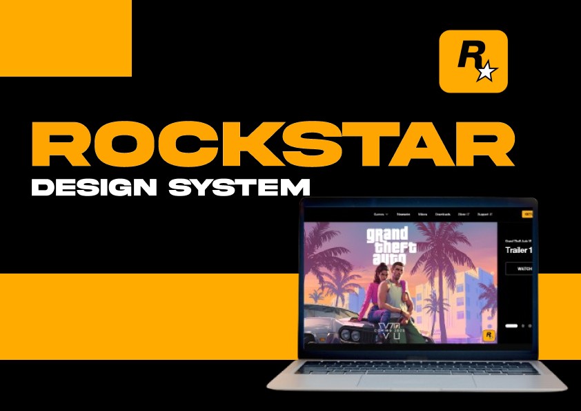
More Details
1. 🔥 Foundations
These are the atomic elements that shape Rockstar’s brand universe.
Typography
Primary: Custom-modified Impact-inspired sans-serif for titles.
Secondary: Sleek grotesque typefaces (e.g., Neue Haas, GT America) for body.
In-Game Font System: Grid-based bitmap alignment for pixel-perfect HUD/UI clarity.
Color System
Core Palette: Black, Rockstar Yellow, Deep Crimson, Asphalt Gray.
Extended Palette: Moody neon tones (for GTA), sepia/earth tones (for RDR).
Dark Mode Priority: All digital touchpoints default to high-contrast dark mode.
Iconography
Custom, minimal, rebellious edge. Sharp corners, high contrast.
Designed for command recognition in games and quick scanning on web/app.
Spacing & Grids
8pt baseline grid for screen design.
4pt micro grid for HUD & mini-maps.
Margin Protocols: Max screen real estate, edge-to-edge layouts encouraged where brand-appropriate.
2. 🧩 Components
Standardized yet flexible elements for product, marketing, and in-game UI.
Buttons
Variants: Primary, Secondary, Ghost, Icon-only.
States: Hover, Focus, Active, Disabled—with tactile motion cues.
Navigation
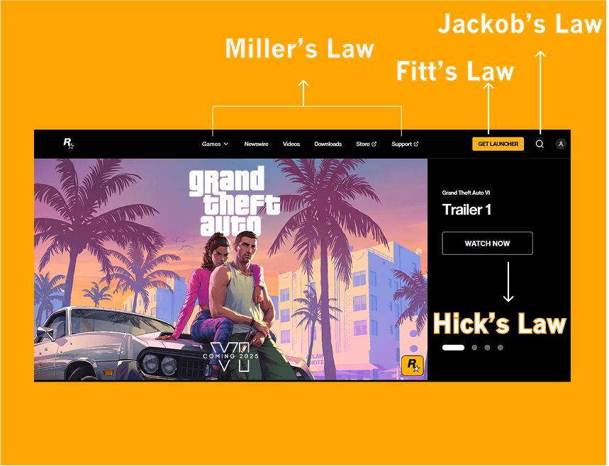
Adaptive, skeuomorphic in-game nav vs minimal nav on web.
Mega menus for deep product categories (e.g., game titles, news).
Forms
Clean, single-column logic.
Error states inspired by crime/noir motifs—blood red highlights, minimal alerts.
Interactive Elements
Carousels, toggles, tabs, HUD sliders, minimap popups.
Microinteractions rooted in tactile feedback and Rockstar’s game-world logic.
3. 📐 Templates
Battle-ready layouts and patterns for building consistently across all mediums.
Web UI
Product Pages, Game Launch Countdowns, News Portals, Community Hubs.
Grid Templates (12-column with edge bleed options).
Mobile App UI
Newsfeed, Companion Apps, Game Stats, Live Maps.
One-handed UX optimization and dark-mode exclusive interfaces.
In-Game UI
HUD Templates, Inventory Screens, Mission Briefs, Stat Overlays.
UX behavior rules based on gameplay type (FPS, open-world, sim).
4. ♿ Accessibility
Rebels don’t exclude.
Compliance: WCAG 2.2 AA minimum across all surfaces.
Game-specific:
Subtitles with adjustable sizing.
Motion toggle to reduce nausea triggers.
Colorblind-safe palette filters.
Web & App:
Keyboard nav, ARIA tags, high-contrast toggle.
Real-time screen reader compatibility with updates.
5. 🛠️ Governance
Creative freedom with system discipline.
Versioning
Semantic versioning (e.g., RDX.2.3 = Red Dead eXperience v2.3)
Release notes distributed to internal teams quarterly.
Contribution Rules
Design tokens via Figma & synced to GitHub repo.
Pull requests reviewed by core design ops team + brand guardians.
Maintenance
Monthly audits.
Component usage stats tracked via Figma analytics + dev tooling.
Community feedback loop via DesignOps Jira board.
